
SYSTEMATIZING INDUSTRY-SPECIFIC VISUAL GEOMETRY FOR THE DARBY LAW GROUP SUB-BRAND
6
SUB-BRAND_SYSTEM_FORMATS
100%
MONOCHROME_FIDELITY
1PX
STRUCTURAL_GRID_ALIGNMENT
CLIENT_PROFILE:
The Darby Law Group (Railroad Transportation Advocacy)
CORE_SERVICE:
Industry-Specific Sub-Brand Architecture
INITIAL_STATE:
Vector Scaling Instability
TECH_STACK:
Vector Geometric Construction
ENGINEERING_DURATION:
4 Days Production & Deployment Cycle
PROJECT_CORE_BRIEF
The specialized Railroad Law division of The Darby Law Group required a distinct visual identity that instantly communicates deep expertise in railway industrial litigation while maintaining structural alignment with the master brand. The core challenge was to programmatically integrate the visual metaphor of steel railway tracks into the typography, ensuring the complex horizontal vectors remain stable, scalable, and authoritative.
The primary creative objective was to engineer a high-durability vector emblem, establish precise sub-brand margin rules, and compile a production-ready asset suite optimized for high-end corporate stationery and tactile physical applications.
THE SOLUTION
01
METAPHOR_GEOMETRY_AUDIT
Analyzed structural boundaries of the primary brand typography. Mathematically integrated an iconic, perspective-driven railway track mark directly into the logotype spacing, securing perfect optical balance.
02
ADAPTIVE_SUB-SYSTEM_GRID
Engineered 6 responsive layout configurations. Adjusted vector weight thresholds to prevent visual blending of the detailed railway track lines on micro-displays and high-density digital layouts.
03
MONOCHROME_STABILITY_TUNING
Developed a high-fidelity monochrome paint specification, ensuring the logo retains absolute contrast and crisp edges during debossing on dark substrates or high-impact spatial signage.
04
ASSET_PRODUCTION_READY
Formulated a strict visual guideline manual defining clean clearance limits, exact grid alignments, and color specifications for corporate stationeries, envelopes, and legal documentation.
THE VISUAL PROOF
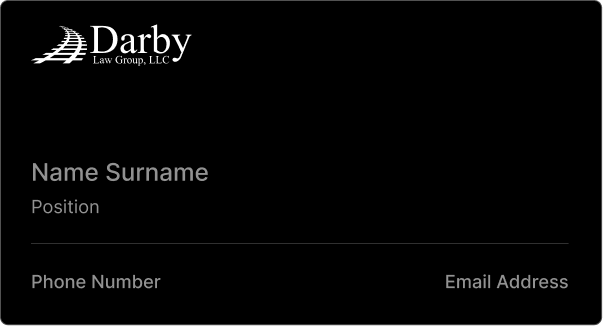
VERIFIED_RESULTS
Restructuring the sub-brand’s vector geometry and deploying rigid structural lockup rules successfully secured total brand cohesion. The finalized industrial-legal identity guarantees immaculate reproduction across both digital interfaces and tactile physical assets, cementing Darby’s status as a dominant leader in specialized advocacy.
6
SUB-BRAND_SYSTEM_FORMATS
Systematic asset deployment
100%
MONOCHROME_FIDELITY
Optical contrast assurance
1PX
STRUCTURAL_GRID_ALIGNMENT
Vector precision guarantee
NEXT PRODUCTION PROOF
Premium hospitality brand identity
BRAND IDENTITY DESIGN
Anchor & Aisle required a high-fidelity visual system and adaptive brand assets to project premium hospitality across every physical and digital touchpoint, replacing an inconsistent brand footprint.
100%
Read Case study →LET`S GET STARTED

LET`S GET STARTED
LET`S GET STARTED
LET`S GET STARTED
LET`S GET STARTED
LET`S GET STARTED
LET`S GET STARTED
LET`S GET STARTED
LET`S GET STARTED
LET`S GET STARTED
LET`S GET STARTED
LET`S GET STARTED
Ready to elevate your digital presence? Get in touch and let’s start a conversation about your project.
Prefer a direct conversation?
Schedule a 30-minute discovery call to discuss your project goals.
Prefer email? Reach out to us directly at:
Or just simply call us by phone